Owner Dashboard
The owner dashboard (dashboard.owner.com) is a large SPA application (25 top level pages) written in Vue and Vuex. This system acts as the CMS for restaurant owners to modify everything about their online presence.
This application is designed as a one-stop-shop for anything a restaurant owner would like to do, including but not limited to
- Update website
- Events
- Pages
- Custom Forms
- Modify menus, items, modifiers, and coupons
- View and modify (refund and charge) orders
- Manage user reviews
- Manage job applications
- Manage connected devices (in store tablets)
- Modify store hours
- Modify subscription
- Modify data within external services (Google my Business)
- Integrate and update connected domains
- Run and export built in and custom reports for orders, taxes, customer acquisition rates, etc...
When I started working on this project (July 2021) we had an application that worked, but was not modern or polished.
Key issues and solutions
Informal presentation
In general, our audience is not part of a crowd that wants to view their financial data with a playful font and heart eyes icons.
The hierarchical structure of the navigation
The dashboard was not structured in an intuitive way. We came to realize that most of our users thought of locations as a part of the brand, not as an entity itself. The location list with links on the side of the navigation did not scale as multiple locations were added, nor did our users understand the hierarchy there.
To fix this we implemented a component to manage brand and location selection at the top (highlighted with the red arrow)
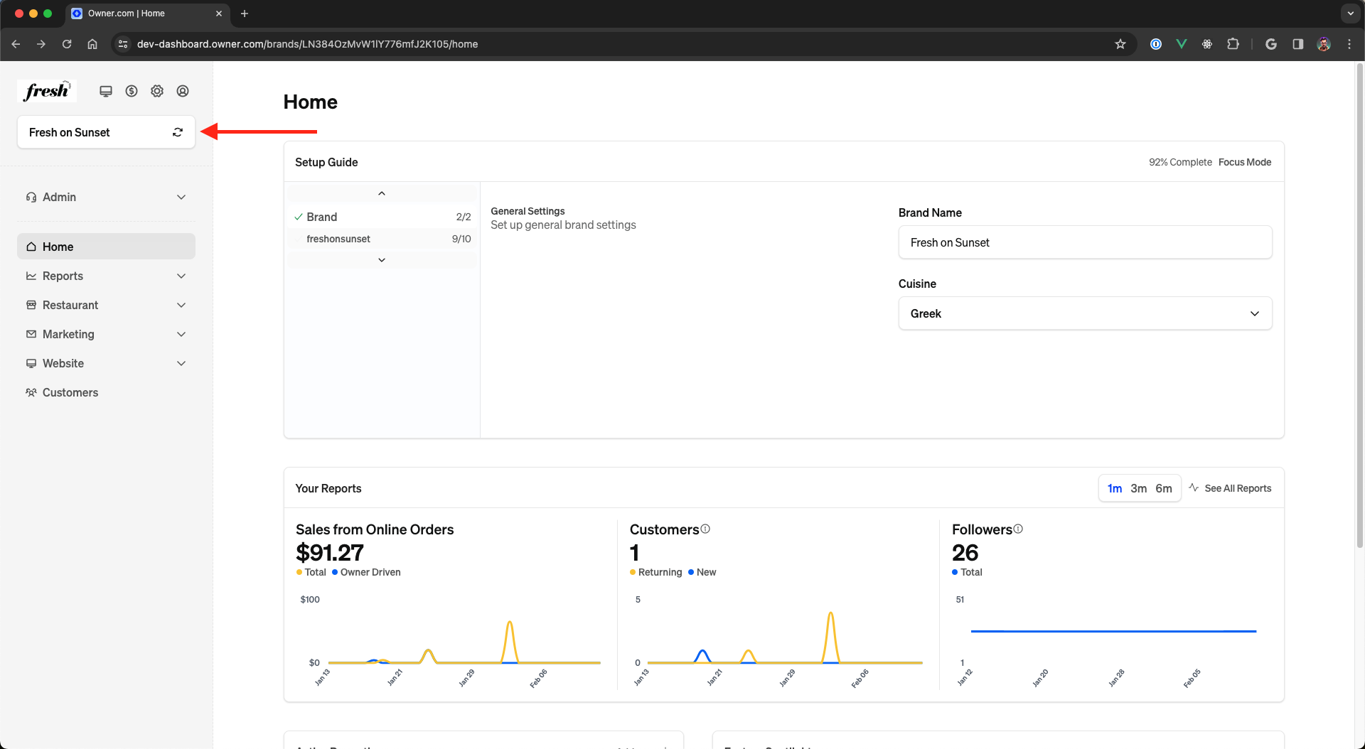
This structure allows us to maintain a specific top level navigation and the page changes filter context depending on the state of what is currently selected in the brand/location selector.
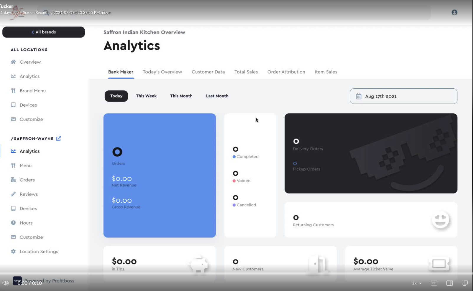
High information density
Many pages we had (such as the one displayed above) had high information density and information hierarchy issues. The following image shows some of these issues
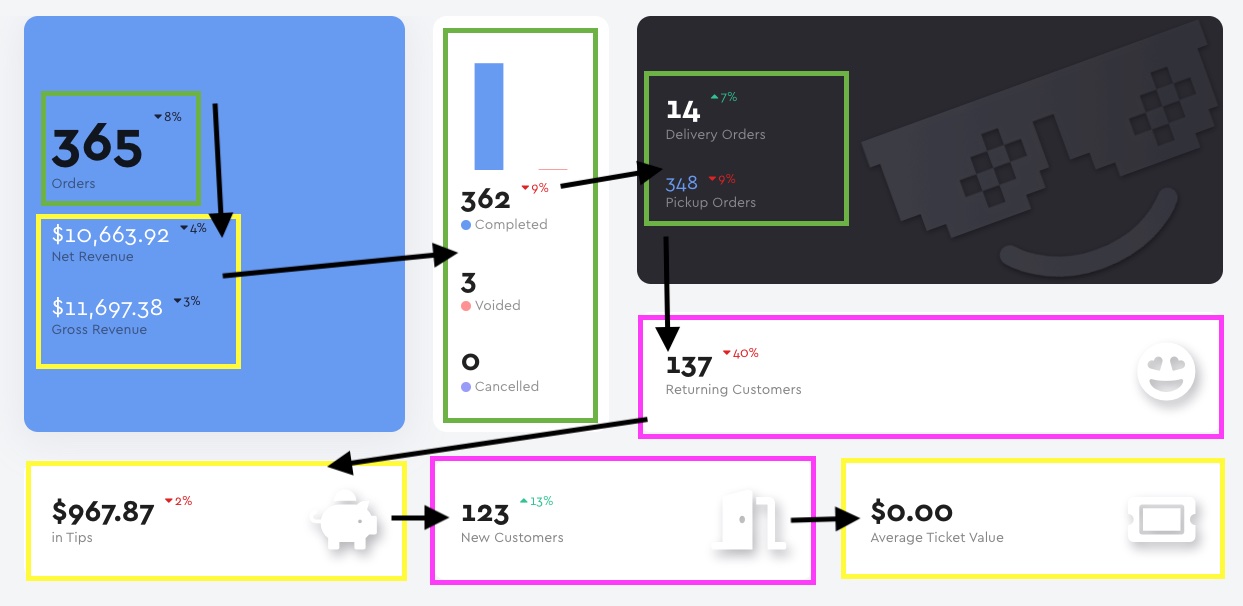
In this image we take different types of data and overlay a common z scanning pattern people use to view information dense pages. Not only is there a lot of information here which does not follow any sort of information hierarchy, but the scanning pattern highlights 6 different instances of context switching on this page alone. Through my time here I've spent quite a bit of time working with our designers to highlight and mitigate these issues. If you take a look at the new email builder (more in depth details about the builders coming soon) we see another page with quite a bit of information but a wonderful hierarchy and management of the complexity. Our designer (Rob Swift) deserves a tremendous amount of credit for helping clean this up and bring the designs to this level.
Unsafe sharing of components
This problem is the first developer centric scaling topic. As the application grew and became very large we started running into scaling issues in a unique way. These issues were not the typical scaling issues (query management for instance) - more of issues of component management. This problem fascinated me. We've all run into the technical scaling issues before, but this was not the typical category of scaling issues.
There were two issues here (the second will be discussed in API-first base components). First and foremost we started
running into unsafe sharing of components. We'd have components that would have to change some store state. Some of
these components would manage the full lifecycle of state, some would be internal components that would have an
expectation that the store was in a specific state before mounting. The organizational structure we were using at the
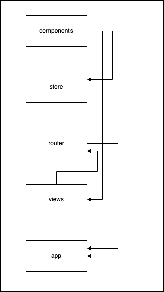
time was a component based structure. This is the typical structure we see in small to medium-sized Vue projects.
src
 | - components
 | | - Customers
 |   | - CustomerTable.vue
 |   | - CustomerCard
 |     | - CustomerHeading.vue
 |     | - CustomerMetrics.vue
 | - router
 | | - customers.js
 | - views
| | - CustomerView.vueThis structure works very well for small projects - no need to reinvent the wheel when you don't have that much data to
work with. The customers.js router will import the CustomerView and the CustomerView will import
the CustomerTable and the CustomerCard. What happens when we now want to show just a piece of the customers card (
say the CustomerHeading) in another location?
src
 | - components
 | | - Orders
 |   | - OrdersTable.vue // Wants to import the customer heading
 | | - Customers                 |
 |   | - CustomerTable.vue       |
 |   | - CustomerCard            |
 |     | - CustomerHeading.vue - |
 |     | - CustomerMetrics.vue
...Is the customer heading safe? Say the customer heading actually is connected to the customer store via
the CustomerCard. The CustomerCard manages the store lifecycle and using the CustomerHeading outside the store
causes unstable store states to occur and imports to go wild.
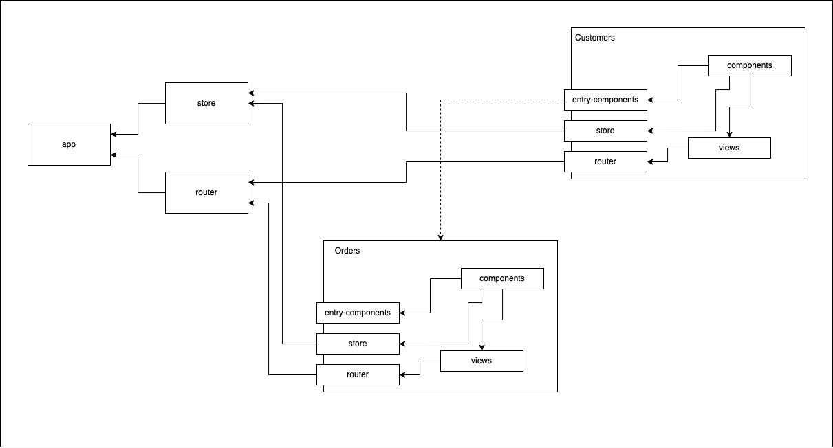
The fix to this was to move to a domain based organizational structure rather than a component based organizational structure. This was only necessary due to the scale of this project, but it ended up being a great fit. Introducing what I call a "feature module" fixed this.
Feature modules define a structure for components revolving around common data.
/components- private components, usually stateful./sub-feature-1component-1- Component only used in sub-feature-1
/sub-feature-2
/entry-components- Components that are public to the module (can be consumed by other modules safely)/config- Any Configuration for the module (if applicable)/store- Store Module (if applicable)/router- Router for module (if applicable)/views- Stateful Layout components, entry point for router
This change causes imports to follow a structure and become much safer. Now, if the module declares the component as safe to use it can be imported from the top level, without reaching into the internals of the module.
import {CustomerCard} from '@/features/customers'If the component you are trying to use is not deemed "safe" it will not be exported from the feature module.
API-first base components
Another initiative I'm pretty proud of is the focus on API first base components. This coupled with the feature module system creates a very scalable application where engineers can safely follow the patterns defined. Early in the life of this application, the base components were not actually acting like base components. They were not opinionated based on how we wanted the application to look. Rather than having components with a few variants (what we want) we had components that exposed raw internals, causing the styling system to leak out of the ui layer of the application. See examples below.
Starting API
<Button v-bind="{
  color: '#fafafa',
  outlined: true,
  isDarkMode: false,
  hoverColor: '#eaeaea'
  }">
</Button>This required the engineers to create utilities such as the following to maintain consistency across the application
<Button v-bind="{
  color: getBrandColor(),
  outlined: true,
  isDarkMode: false,
  hoverColor: getBrandHoverColor()
  }">
</Button>These lookups were happening in JS (performance issue) and would cause change detection to trigger through the entire tree.
I started revamping our components with the API in mind, trying to push the styling into the base components. The above button component api would be consolidated to something similar to the following.
<Button variant="outlined" color="primary"></Button>Reducing the size of the API allows the base components to maintain a strong boundary around what they are design to control - styles.
Conclusion
The Owner.com dashboard has come a long way since I first started working on it. We now have a well-defined structure, base components that maintain the proper level of abstraction, and a beautiful design system which fits very well with our customer base.